First
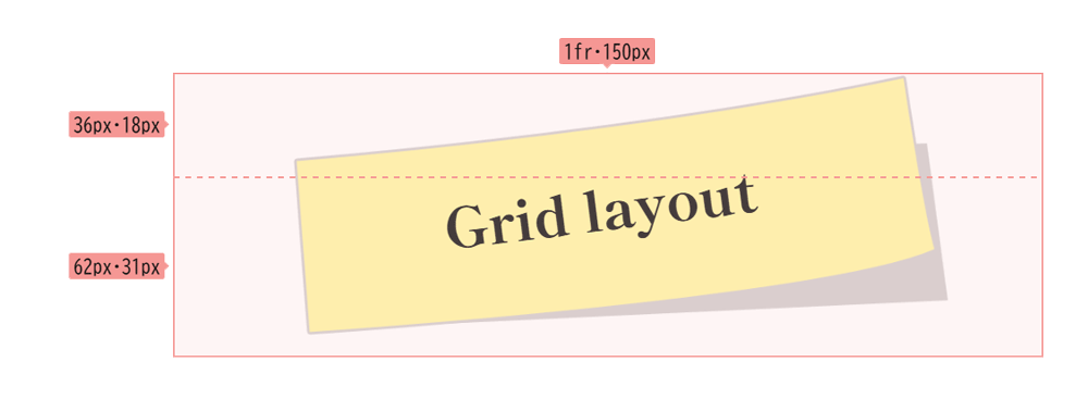
文字の配置をグリッドレイアウトでデザインする
グリッドレイアウトで作るアイキャッチ
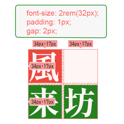
風
来
坊
グリッドレイアウトのサイズはコンテナで定義される。上の「風来坊」という文字はフォントサイズが 2rem(32px)、padding が 1px 、グリッドの1マスの高さと幅が各々 34px、文字と文字の間隔に gap: 2px; 、つまり文字を包括するコンテナの高さと幅が 70px のように定義される。
グリッドレイアウトで文字を配置して「flort: left」で文字を回り込ませてみよう。これまでの慣習でこのような使い方は思いつかなかった。このミニマリズムは使える。
<div id="grid-container-standard-5">
  <div id="itemA-5">風</div>
  <div id="itemB-5">来</div>
  <div id="itemC-5">坊</div>
</div>
#grid-container-standard-5 {
display: grid;
grid-template-rows: 34px 34px;
grid-template-columns: 34px 34px;
/*grip-auto-rows: 34px; */
height: 70px;
width: 70px;
gap: 2px;
margin-right: 1rem;
marin-bottom: 1rem;
padding: 0;
place-content: start;
background-color: #fff;
font-family: "Shippori Mincho", serif;
font-weight: 800;
font-style: normal;
float: left;
}#itemA-5 {
grid-row: 1 / 2;
grid-column: 1 / 2;
color: #fff;
writing-mode: horizontal-tb;
box-sizing: border-box;
background-color: #eb4034;
font-size: 2rem;
font-weight: 900;
padding: 0;
z-index: 2;
line-height: 1;
}
#itemB-5 {
grid-row: 2 / 3;
grid-column: 1 / 2;
color: #fefefe;
font-weight: 900;
writing-mode: horizontal-tb;
box-sizing: border-box;
background-color: #0d8011;
font-size: 2rem;
padding: 0;
z-index: 2;
line-height: 1;
}
#itemC-5 {
grid-row: 2 / 3;
grid-column: 2 / 3;
color: #fefefe;
font-weight: 900;
writing-mode: horizontal-tb;
box-sizing: border-box;
background-color: #0d8011;
font-size: 2rem;
padding: 0;
z-index: 2;
line-height: 1;
}グリッドコンテナとアイテムのサイズに慣れる
気
炎
万
丈
全体サイズを縮小してみた。こういう凡例をいくつか熟せば、複雑なグリッドレイアウトも可能になる。例えば、CSSのグリッドレイアウト内でさらにグリッドレイアウトを作成するには、ネストされたグリッドを使用する。親グリッドの子要素として別のグリッドコンテナを配置することで、入れ子構造を実現できる。